Last month, the Pantone Color Institute extended its influence on consumer tastes and designs by naming “Very Peri” as its Color of the Year for 2022. Rather than selecting a color from its existing and extensive palette, the institute created an entirely new hue for its annual pick.1
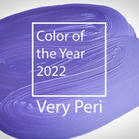
Grounded in color theory, representatives for Pantone expressed that this year’s choice combines the qualities of blues with a violet-red undertone to “encourage courageous creativity and imaginative expression,” which is important as we continue to forge our way through these transformative times.
Like the institute, marketers understand the psychology of color and how it contributes to the success of a brand. The right choice of color not only builds on a brand’s aesthetic, but also grabs the consumer’s attention by eliciting a select emotional response. Tying this year’s color to our current state of being, the institute shared that Very Peri – blending trusted or reliable blues with a spirited violet-red – is reflective of how our physical and digital lives are merging in new ways. Microsoft appears to have understood the assignment, and is already on-trend, as the color story for its TEAMS videoconferencing technology has employed periwinkle-hued elements for some time now.
And while many brands are exploring how to position themselves and their trade dress across various digital platforms, including in the metaverse, still others are creatively exploiting or celebrating their brand’s colors out in the real world. For example, in celebration of the upcoming Chinese lunar New Year, Bottega Veneta recently displayed a greeting on the Great Wall of China, with its “Bottega Green” color serving as an eye-popping background.2 Also earlier this month, the tower of the Empire State Building was illuminated in the iconic orange color of the TODAY show to commemorate its 70th anniversary.3
If your brand is considering a new hue for its trade dress or messaging – digitally, virtually, or in real life – we encourage you to consider the following before moving forward:
- Conduct a clearance search to determine whether the color(s) of interest are available for use with your goods and services;
- Check existing registrations for any current color marks you own to see if they are due for maintenance. If so, consider adopting the new color(s) for only select models/SKUs to allow you to maintain your existing registrations if they remain of interest;
- Consult with any relevant industry and regulatory teams before adopting a new color scheme to confirm that it is neither misleading of the nature of your product, nor likely to create consumer confusion or to cause harm.
Federal registration of color marks (particularly, single color marks) continues to be a challenge. To improve your brand’s chances of registering a color mark, remember to instruct consumers to look for your brand’s color in the marketplace, use the color consistently to reinforce its association with your brand, and avoid referring to any functional attributes of the color – e.g., the ease of visibility of the color orange – since functional color marks are never registrable.
[1] www.pantone.com/color-of-the-year-2022
[2] www.prestigeonline.com/th/style/fashion/bottega-veneta-lunar-new-year/
[3] www.today.com/news/empire-state-building-lit-orange-celebration-todays-70th-anniversary-rcna12176
This article appeared in the January 2022 issue of MarkIt to Market®. To view our past issues, as well as other firm newsletters, please click here.
Related Industries
Receive insights from the most respected practitioners of IP law, straight to your inbox.
Subscribe for Updates