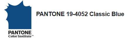
Earlier this month, Pantone announced that its color for year 2020 is PANTONE 19-4052 Classic Blue. Pantone describes Classic Blue as a timeless hue, one that is evocative of the sky at dusk, bringing “a sense of peace and tranquility to the human spirit” as we strive for stability and dependability in the next decade.[1]
Understanding color theory and the psychology of color is critical to the success of a brand. The right choice of color not only builds on a brand’s aesthetic, but grabs the consumer’s attention by eliciting a select emotional response. For example, as applied to fashion, Pantone says that Classic Blue is a “foundational anchor shade,” which speaks to heritage; in the realm of graphic design and packaging, Classic Blue’s semblance to evening twilight evokes a feeling of tranquility, dependability, and constancy.[2]
Some brands such as
and, not surprisingly,
have been using a blue similar to Classic Blue for years. If you’re thinking about refreshing your brand with Classic Blue and its connotations, or any other color for that matter, consider the following before moving forward:
- Conduct a clearance search to determine whether the color of interest is available for use (short- or long-term) with your goods and services;
- If you plan to step away from the brand’s current color in favor of another for a limited period of time, check any trademark registrations for the current color to see if they are due for maintenance during the “off-use” period. If so, consider adopting the new color for only select models/SKUs, or apply the new color to only part of the product’s packaging or label, to allow you to maintain your existing registrations;
- Remember that the color of interest may have an industry- or product-dependent significance. For pharmaceuticals, for example, colors are often used to designate different drug strengths or forms, or may function as proprietary trade dress. Consult with industry and regulatory teams before adopting a new color to confirm that it is neither misleading of the nature of your product, nor likely to create consumer confusion or to cause harm.
If you are looking to secure a federal registration for the color of your brand, remember that the USPTO reviews single color mark applications very strictly, requiring extensive evidence of acquired distinctiveness or secondary meaning. Improve your chances of federally registering your color mark by:
- Referencing your brand’s color in “look for” advertising – that is, advertising language that instructs the consumer to “look for” your brand’s color, to confirm that they are choosing your product among competing products. Also list the color as a trademark in a legal line;
- Use the color consistently to reinforce its association with your brand in the mind of the consumer. To assist in this effort, develop a brand usage guideline, which sets forth the official color as well as the approved manner in which the color may be used, for your marketing department, authorized licensees, co-branders, and co-operative advertisers;
- Avoid making reference to any attributes of the color of interest, which could be considered “functional” in nature, since functional color marks are not registrable.
Whatever your branding choices, we hope your customers remain true blue in 2020 and beyond!
[1] www.pantone.com/color-intelligence/color-of-the-year/color-of-the-year-2020
[2] www.pantone.com/color-intelligence/color-of-the-year/color-of-the-year-2020-tools-for-designers
This article appeared in the December 2019 issue of MarkIt to Market. To view our past issues, as well as other firm newsletters, please click here.
Related Industries
Receive insights from the most respected practitioners of IP law, straight to your inbox.
Subscribe for Updates